

Designing an SEO‑Friendly UI: When UX Meets Keyword Strategy
When I first stepped into the SaaS world as a product marketer, the mantra was always “design first, SEO later.” That mindset worked fine for landing pages that lived in isolation, but as our platforms grew into multi‑dimensional ecosystems, the clash between user experience (UX) and on‑page SEO became impossible to ignore. In this post I’m pulling back the curtain on a methodology I’ve refined over the past few years: crafting UI components that delight users and signal relevance to search engines.
Why UI and SEO Should Speak the Same Language
Search engines have evolved from keyword‑matching bots to sophisticated entities that can interpret layout, hierarchy, and even visual cues. Google’s Page Experience updates are a testament to that shift. If a page looks great to a human but confuses crawlers, you’re leaving traffic on the table. Conversely, stuffing invisible text or over‑optimizing headings may boost rankings short‑term but will erode trust and increase bounce rates.
The sweet spot lies where visual design, content hierarchy, and technical signals converge. Below I break down the core pillars of an SEO‑friendly UI, peppered with practical tactics you can start implementing tomorrow.
1. Semantic Layouts That Guide Both Users and Crawlers
HTML5 introduced semantic tags (<header>, <nav>, <section>, <article>, <aside>, <footer>) to give meaning to page sections. Modern UI frameworks often default to generic <div> containers for flexibility, but that convenience can mask the page’s logical structure from search engines.
- Start with a clear hierarchy. Use
<h1>for the primary product promise, followed by<h2>for major feature groups, and<h3>for sub‑features. This hierarchy mirrors how users scan a screen and how crawlers parse relevance. - Wrap related UI blocks in
<section>tags. For a SaaS pricing page, each plan can be a<section>with its own heading, description, and call‑to‑action (CTA). This signals that each plan is a distinct topic, helping Google understand the page’s breadth. - Leverage
<aside>for supplemental content. FAQs, sidebars, or related‑resource widgets belong here. Search engines often surface<aside>content in rich results, especially when paired with structured data.
By aligning your visual hierarchy with semantic markup, you give both users and crawlers a roadmap to the most important information.
2. Intent‑Driven Copy Placement
UX writers spend hours crafting microcopy that feels human. SEO specialists, on the other hand, chase keyword density. The middle ground is to place high‑intent phrases exactly where users naturally look for them:
- Hero Section. The headline and sub‑headline are the first thing users read. Include your primary target keyword here, but keep it conversational. For example, “Streamline Team Collaboration with Real‑Time Docs” blends intent with brand tone.
- Feature Cards. Each card should answer a specific user question. If a user is searching “automated reporting for SaaS,” ensure that phrase appears in the card’s title and supporting paragraph.
- CTA Buttons. Button copy is a hidden SEO goldmine. While button text isn’t a ranking factor per se, it reinforces the page’s semantic relevance. “Start Free Trial” paired with “automated reporting” in the surrounding copy creates a cohesive signal.
Remember: the goal isn’t to cram keywords but to meet the user’s mental model. When the copy mirrors search intent, you simultaneously improve relevance and conversion.
3. Visual Elements That Communicate Context
Images, icons, and videos are integral to SaaS UI, yet they’re often overlooked in SEO planning. Here’s how to make them work for you:
- Descriptive
altattributes. Instead of “screenshot1.png,” use “dashboard view of real‑time analytics for marketing teams.” This not only aids accessibility but also gives crawlers contextual clues. - Schema‑enabled media. If you’re showcasing a tutorial video, wrap it in
<videoObject>schema. This can unlock video rich snippets, driving additional traffic. - Lazy‑load with care. Lazy‑loading improves page speed—a critical ranking factor. Ensure that above‑the‑fold assets load immediately, and provide fallback
noscripttags for crawlers that may not execute JavaScript.
4. Navigation That Balances Depth and Crawlability
Deep navigation structures are great for user discovery but can dilute crawl equity if not handled correctly. Here’s a proven pattern:
- Flat primary navigation. Keep top‑level links under six items. Each link should target a high‑intent landing page (e.g., “Pricing,” “Features,” “Resources”).
- Contextual secondary menus. Within a feature page, use a secondary
<nav>that links to sub‑features or related use cases. These secondary links inherit authority from the primary page while staying user‑friendly. - Breadcrumb trails. Implement
JSON‑LDbreadcrumbs to help both users understand their location and search engines map site hierarchy.
For a SaaS product with dozens of modules, this approach preserves depth without overwhelming crawlers. If you need a deeper dive into navigation tactics, check out the building smart navigation guide for SaaS on‑page SEO.
5. Core Web Vitals as a Design Imperative
Page speed, interactivity, and visual stability aren’t just technical checkboxes—they directly influence user perception. A laggy UI drives users to bounce, sending a negative signal to search engines.
- Largest Contentful Paint (LCP). Aim for under 2.5 seconds. Prioritize loading above‑the‑fold hero images and key copy first. Use modern image formats (WebP, AVIF) and serve them via a CDN.
- First Input Delay (FID). Keep JavaScript execution lightweight. Defer non‑essential scripts and leverage
requestIdleCallbackfor background tasks. - Cumulative Layout Shift (CLS). Reserve space for dynamic components (e.g., carousel, lazy‑loaded images). Define explicit width/height attributes to avoid unexpected jumps.
When you design UI components with these metrics in mind, you create a virtuous cycle: happier users, lower bounce rates, and better rankings.
6. Structured Data That Mirrors the UI
While schema markup was covered in a previous post, the focus here is on aligning structured data with the visual layout. If a page uses a “feature comparison table,” tag it with Product and Offer schema that reflects the same rows and columns. This consistency boosts the likelihood of rich results that match the on‑page design.
For SaaS platforms that offer tiered pricing, combine Offer schema with FAQPage markup for each tier’s common questions. The result? Search engines can surface a mini‑FAQ directly beneath the pricing table, echoing the UI’s intent.
7. A Repeatable Audit Framework
To keep UI and SEO in lockstep, I recommend a quarterly audit that covers three dimensions:
- Content‑UI Alignment. Verify that every high‑value keyword appears in a logical visual location (hero, feature cards, CTAs). Use a spreadsheet to map keywords to UI elements.
- Technical Health. Run Lighthouse or PageSpeed Insights on each template. Flag any LCP or CLS issues that arise from new UI components.
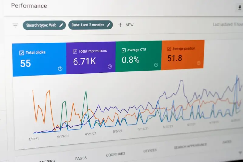
- Search Performance. Pull Google Search Console data for impressions and clicks on pages that received UI updates. Look for correlation spikes or dips.
Document findings in a shared knowledge base (yes, content governance matters here). Assign owners for UI, copy, and dev teams to close gaps before the next release cycle.
8. Balancing Brand Voice with SEO Consistency
Brand voice is the soul of a SaaS company, but it shouldn’t clash with SEO best practices. Here’s how to keep both happy:
- Keyword families. Instead of forcing a single keyword into every sentence, map a family of synonyms and related terms to each UI block. This preserves natural language while covering search intent.
- Dynamic placeholders. For dashboards that display user‑specific data, use placeholder copy (e.g., “Your team’s productivity score”) that includes target keywords without sounding generic.
- Copy style guide. Define rules for headline length, active voice, and keyword placement. Share the guide with designers so they can anticipate copy needs during mockups.
Putting It All Together: A Mini‑Case Study
One of our SaaS clients struggled with a high bounce rate on their Feature Overview page. The UI was sleek but the content was buried deep inside accordions, and the page loaded slowly due to large background images.
We applied the framework:
- Re‑structured HTML. Switched from
<div>containers to<section>tags for each feature, adding appropriate<h2>headings. - Optimized copy placement. Placed primary keywords (“project collaboration,” “real‑time editing”) in the hero and feature card titles.
- Implemented lazy‑loading with size attributes. Reduced LCP by 1.2 seconds.
- Added FAQ schema. Mapped common questions about each feature to an
FAQPageblock beneath the accordion. - Ran a UI‑SEO audit. Documented findings and set up a quarterly review cadence.
Within two months, average session duration rose 35%, and organic impressions for “real‑time editing SaaS” increased by 18%. The UI looked cleaner, the copy felt on‑brand, and the search metrics improved—all without a major redesign.
Final Thoughts: Make SEO a Design Partner, Not a Afterthought
When UI and SEO collaborate from day one, you unlock a multiplier effect: design decisions reinforce relevance, and relevance informs design. The result is a frictionless experience that satisfies users, search engines, and internal stakeholders alike.
Start small—pick a high‑traffic page, run the audit framework, and iterate. Over time, your entire SaaS site will evolve into a cohesive, SEO‑friendly ecosystem that drives sustainable growth.

Related Posts

The Featured Snippet Playbook: Turning On‑Page Content into Position Zero
Discover a proven strategy to design on‑page content that wins featured snippets, boosts visibilit... Read More
Structured Data Secrets: Boosting On‑Page SEO for SaaS Products
Learn how to use schema markup to turn ordinary SaaS pages into rich search results, improve clickâ€... Read More

Human‑Centric On‑Page SEO: Strategies That Speak to Users and Search Engines
Learn how to craft on‑page SEO that balances user intent, semantic HTML, and core web vitals, crea... Read More
Top Posts

Hyper‑Local SEO: Mapping Micro‑Geography for Real‑World Growth
Learn why hyper‑local SEO—targeting micro‑areas, voice queries, and real‑time events—outperforms traditional tactics, and get a step‑by‑step playb...Read More

Beyond Keywords: Building a SaaS Knowledge Graph for SEO Dominance
Learn how to transform your SaaS site into a semantic knowledge graph, leveraging structured data, AI‑driven content, and strategic internal linking to domina...Read More

Why Empathy‑First Content Marketing Wins in a Noisy Digital World
Learn why an empathy‑first approach transforms content marketing, driving deeper connections, higher rankings, and lasting brand loyalty—all without relying...Read More

Social Media as a Live Product Lab for SaaS
Treat social platforms as a live product lab: experiment with hypotheses, gather real‑time feedback, prototype in‑platform, and close the loop to turn socia...Read More
0 Comments
Post Comment
You will need to Login or Register to comment on this post!